
Vows of the Shattered Packaging
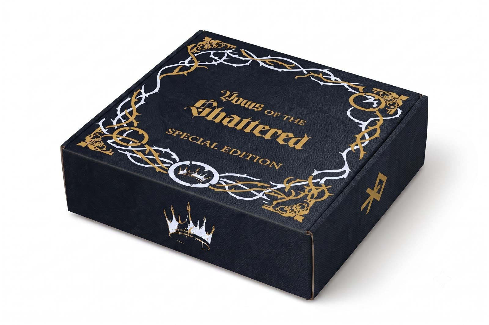
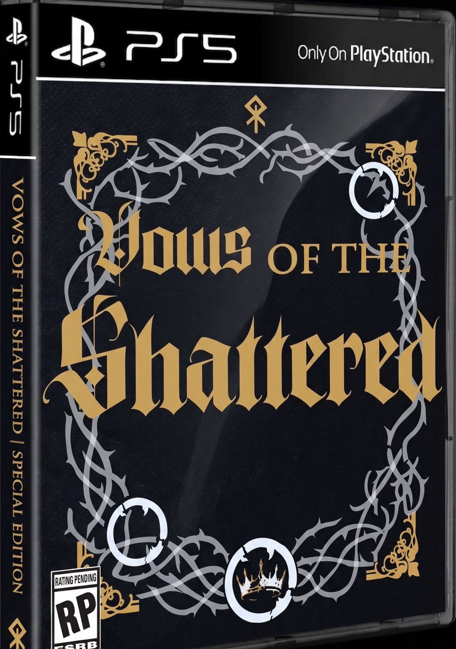
A fictional game packaging project for a limited edition box set with a strong typographic and collectible design direction.
Approach
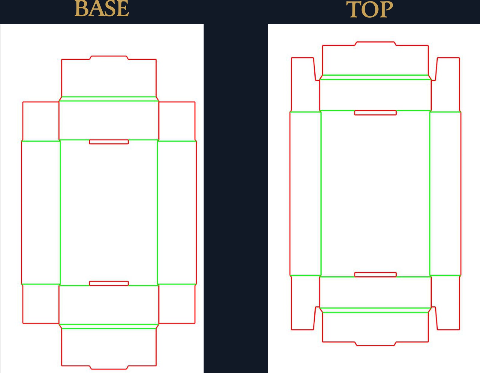
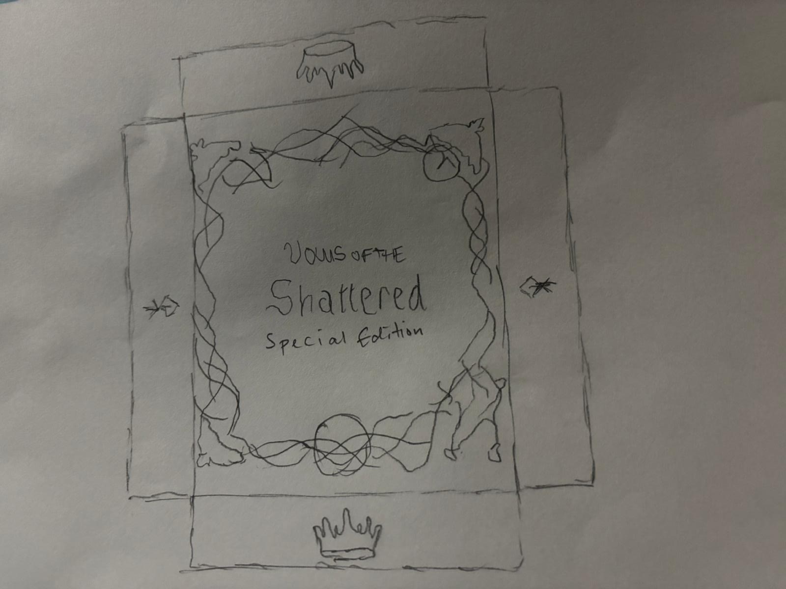
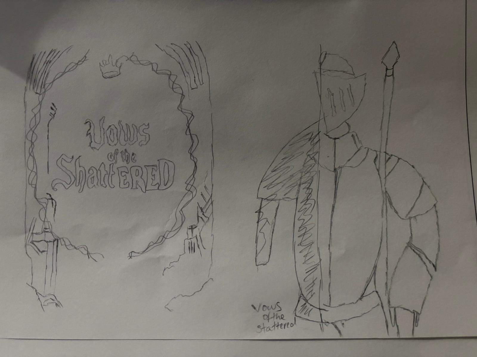
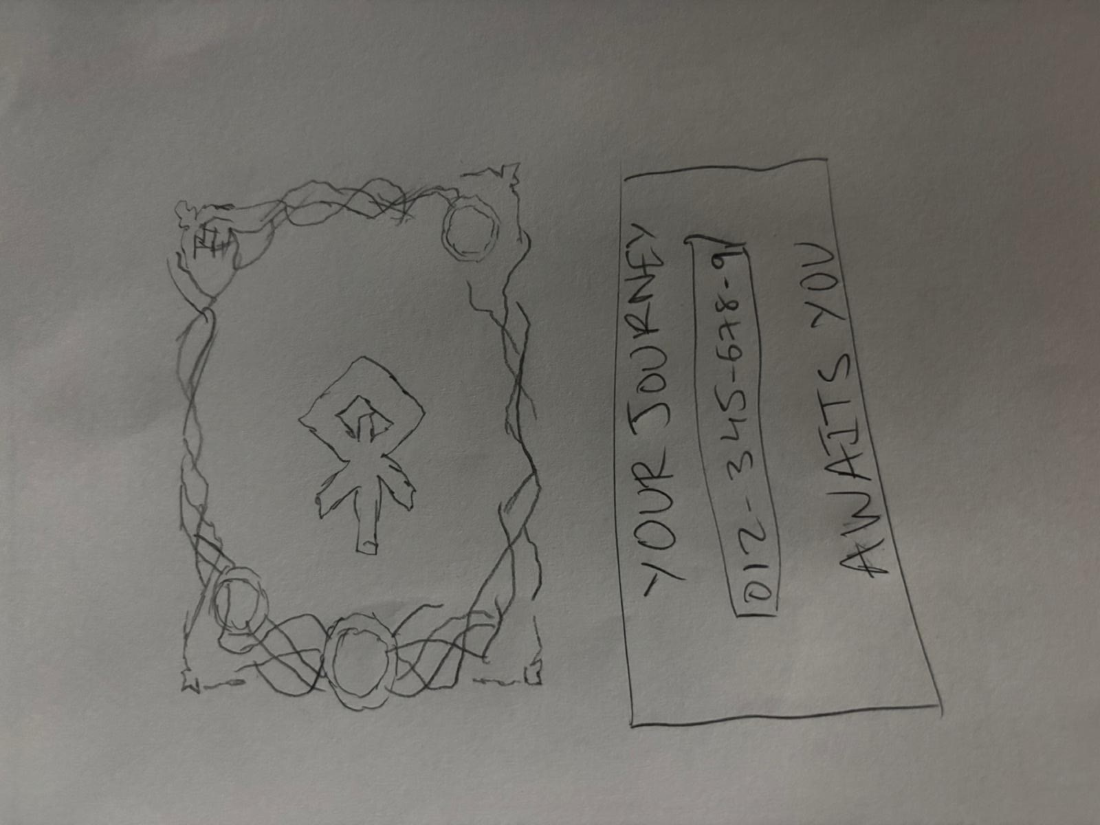
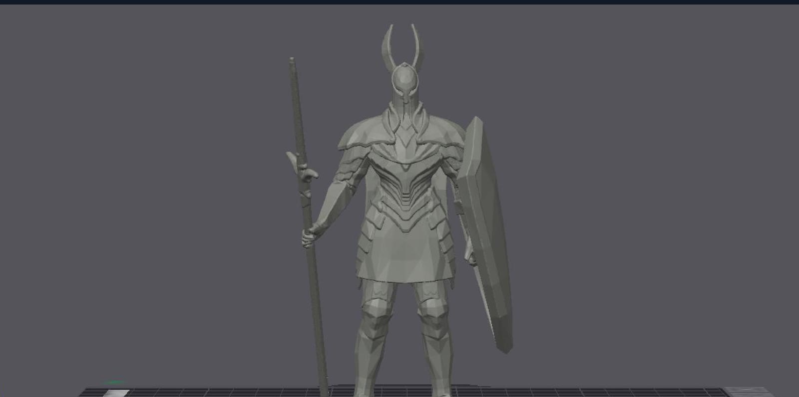
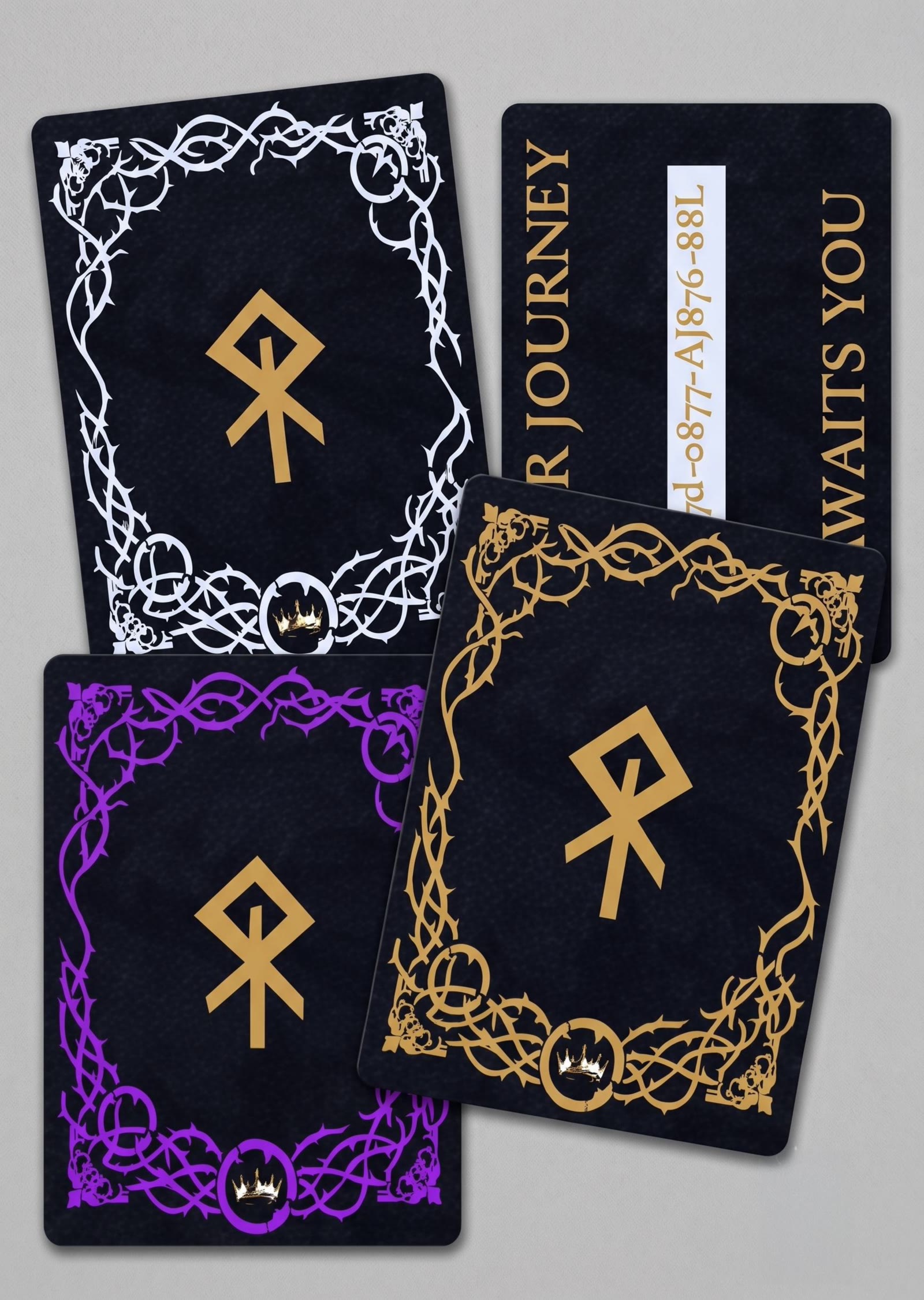
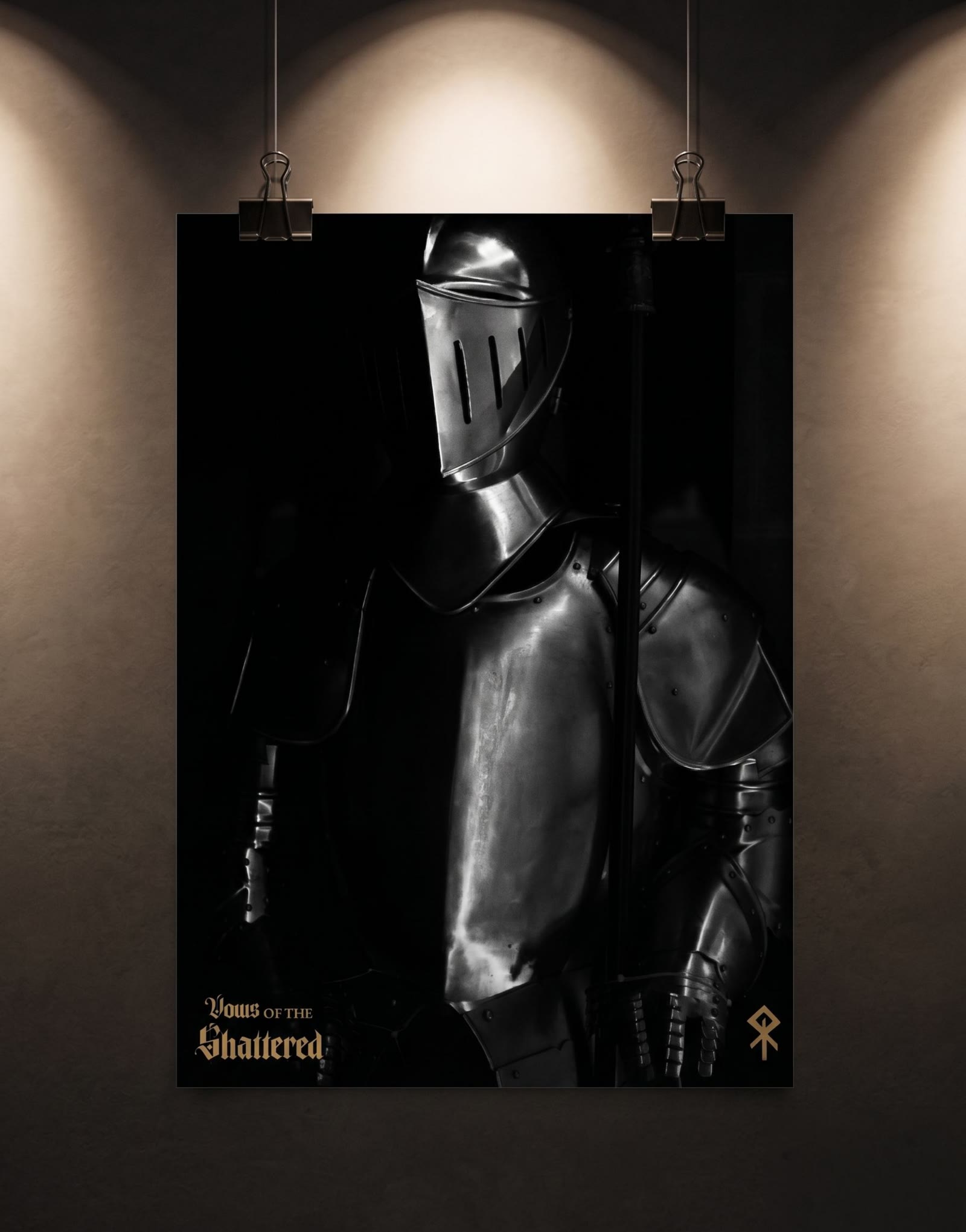
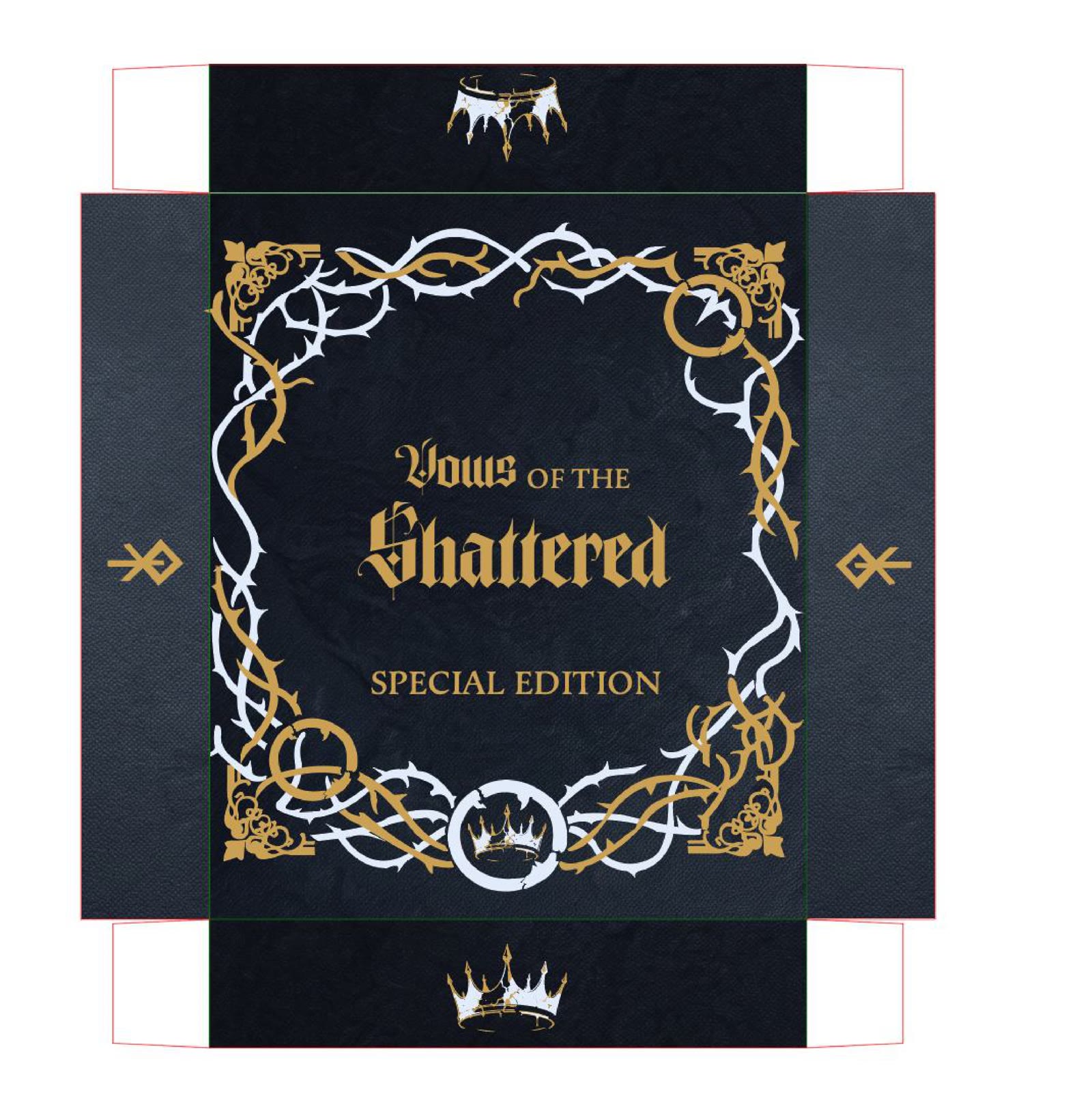
Most Souls-like collector's editions lean on the same formula: a dramatic hero pose front and center on the box. The goal here was to break that pattern entirely and let typography carry the cover instead, so the box had to read as expensive before anyone even opened it. Sketching out the dieline, poster, and cards by hand first, before touching Illustrator, was what kept five different physical pieces feeling like they belonged to the same kingdom.
Sketches
The Set
Die-Line & Artwork
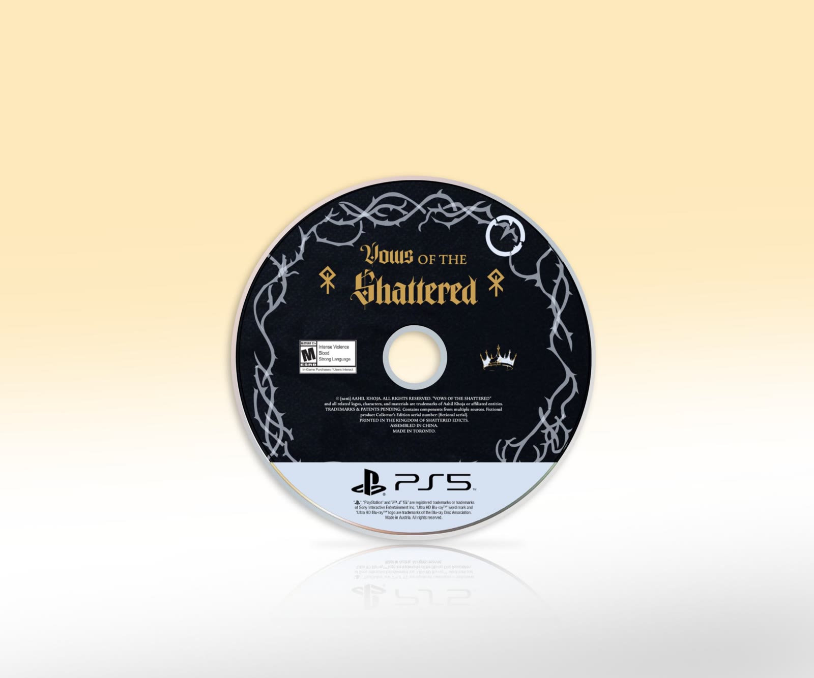
Mockups
Reflection
This one was genuinely fun to work on since gaming is both a hobby and the career path I actually want to end up in, especially after getting hooked on Souls and Souls-like games. That made the whole project feel less like an assignment and more like something I would want to keep working on.
The poster gave me the most trouble. I kept going back and forth on whether to keep it type based like the rest of the set or make it read like a normal game poster, and I never fully landed on an answer I was confident in. The designs also just took longer than expected across the board, but it was worth it.