
Shizuka Matcha Packaging
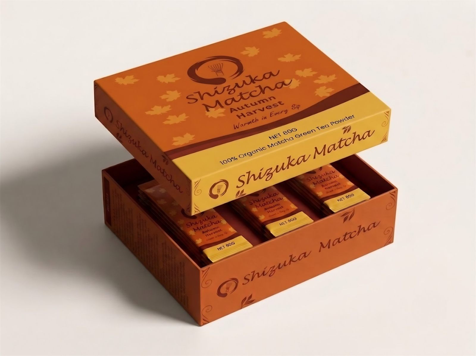
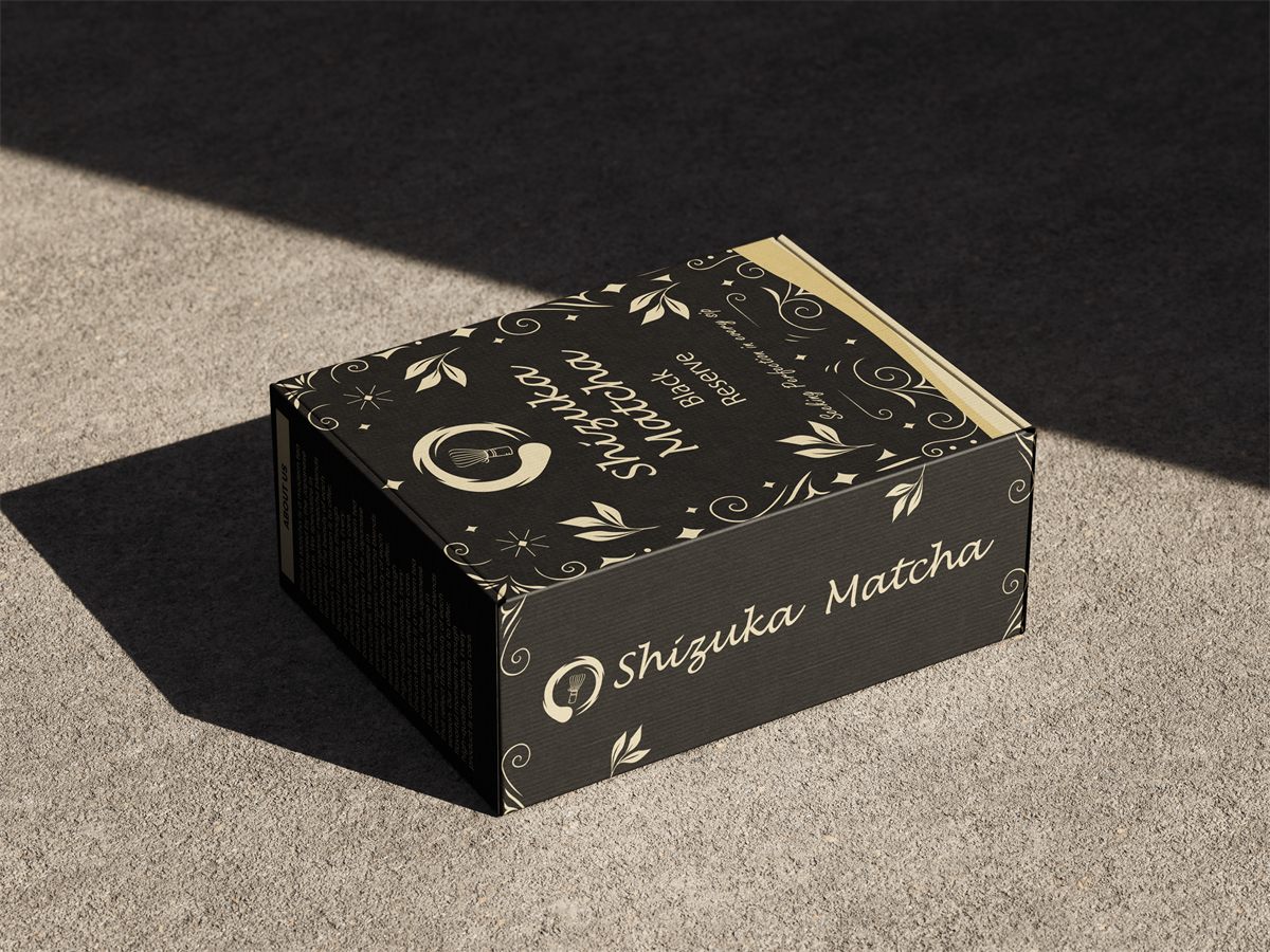
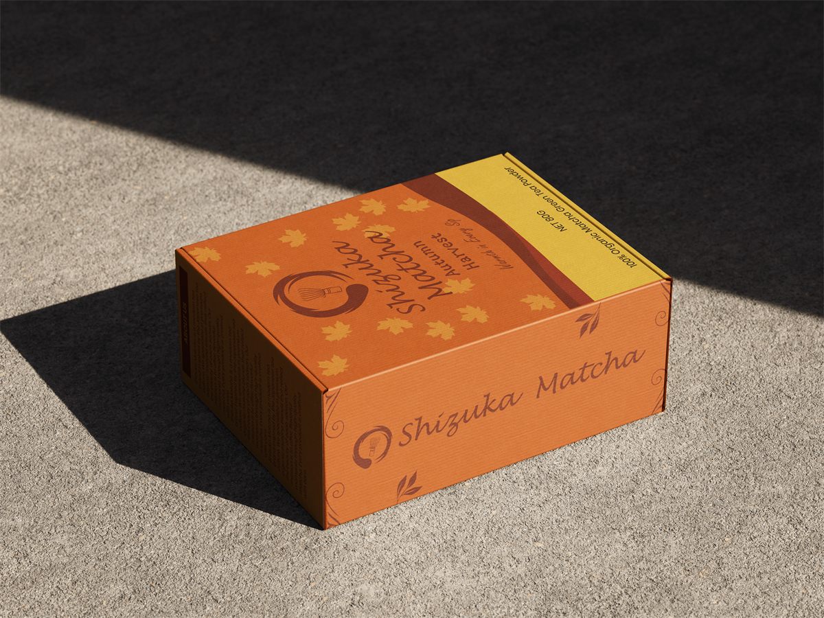
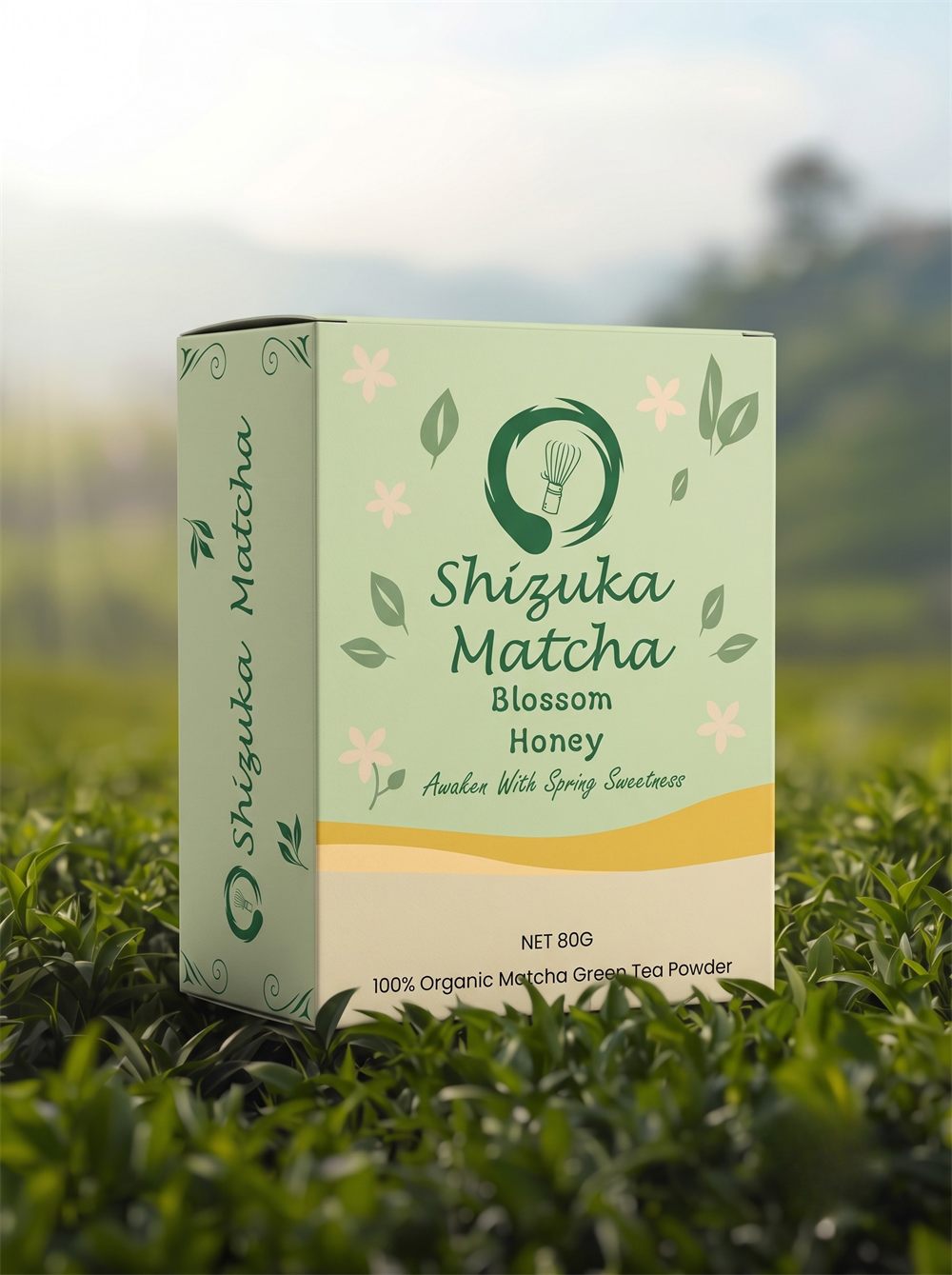
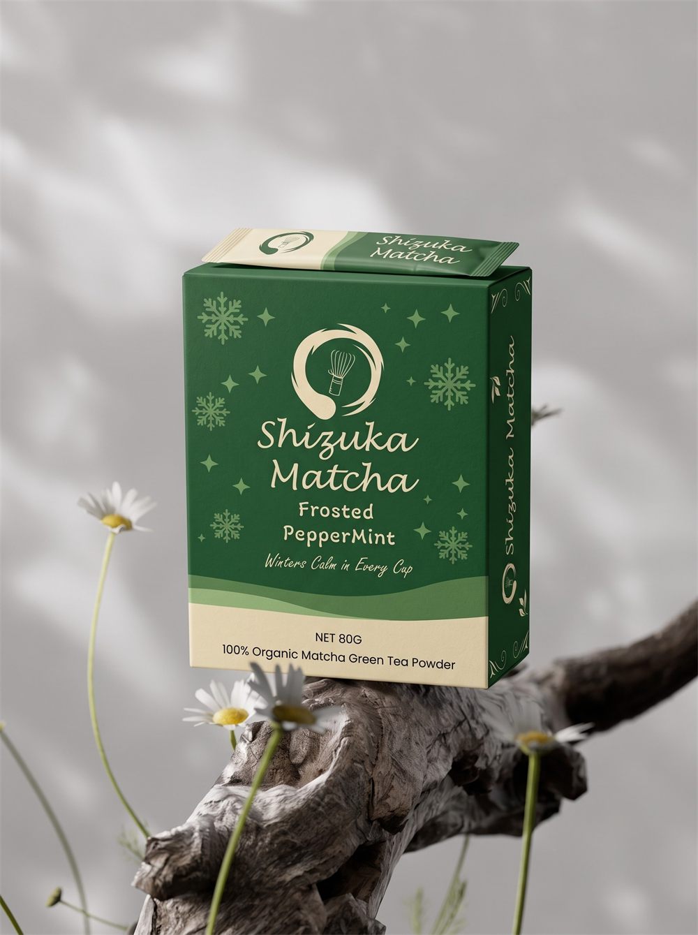
Shizuka Matcha is a packaging project I built around four seasonal flavors. I wanted each box to feel a little different depending on the season, but still look like it belongs to the same brand once they are all lined up together on a shelf.
Approach
The plan from the start was to nail one box first, then figure out how to expand it into a full flavor line without it turning into four unrelated designs. Before any of the visual work, the hardest part was actually landing on the flavor names and the flavor list itself, since everything else depended on getting that foundation right. Keeping the same logo across every box instead of giving each flavor its own mark is what makes the line read as one brand instead of four separate ones.
The Flavor Line
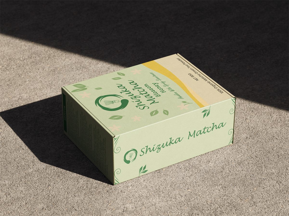
Packaging Details
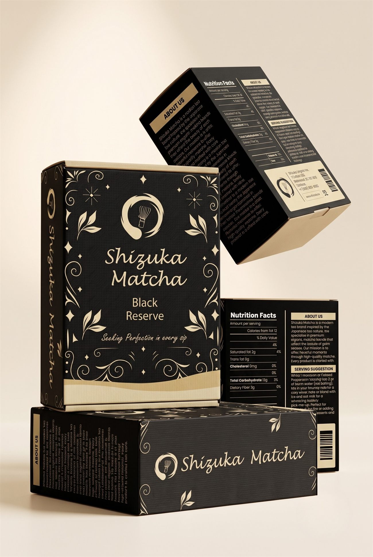
More Mockups
Reflection
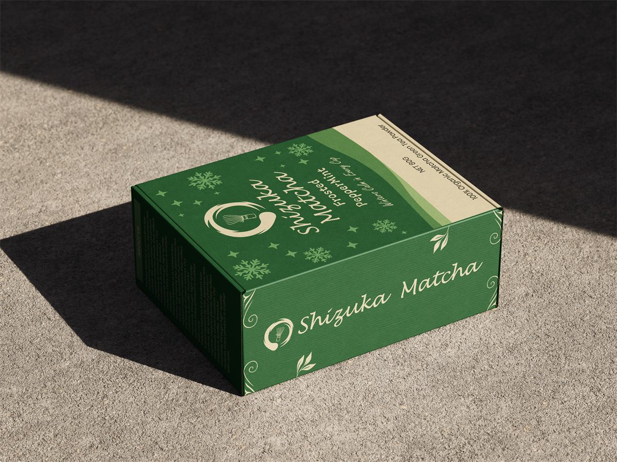
Working on Shizuka Matcha pushed me to think about branding as a system rather than one single design. Keeping the logo, typography and layout locked while letting the color and illustration shift by season was harder than it sounds, and it is the part of this project I am proudest of.
If I went back to it now, I would spend more time on the Frosted Peppermint illustration since it still reads a bit too close to the Black Reserve version. This project also taught me how much restraint matters in packaging design. It is easy to keep adding detail, but it takes more discipline to know when a design is actually finished.