
SmartSplit App Design
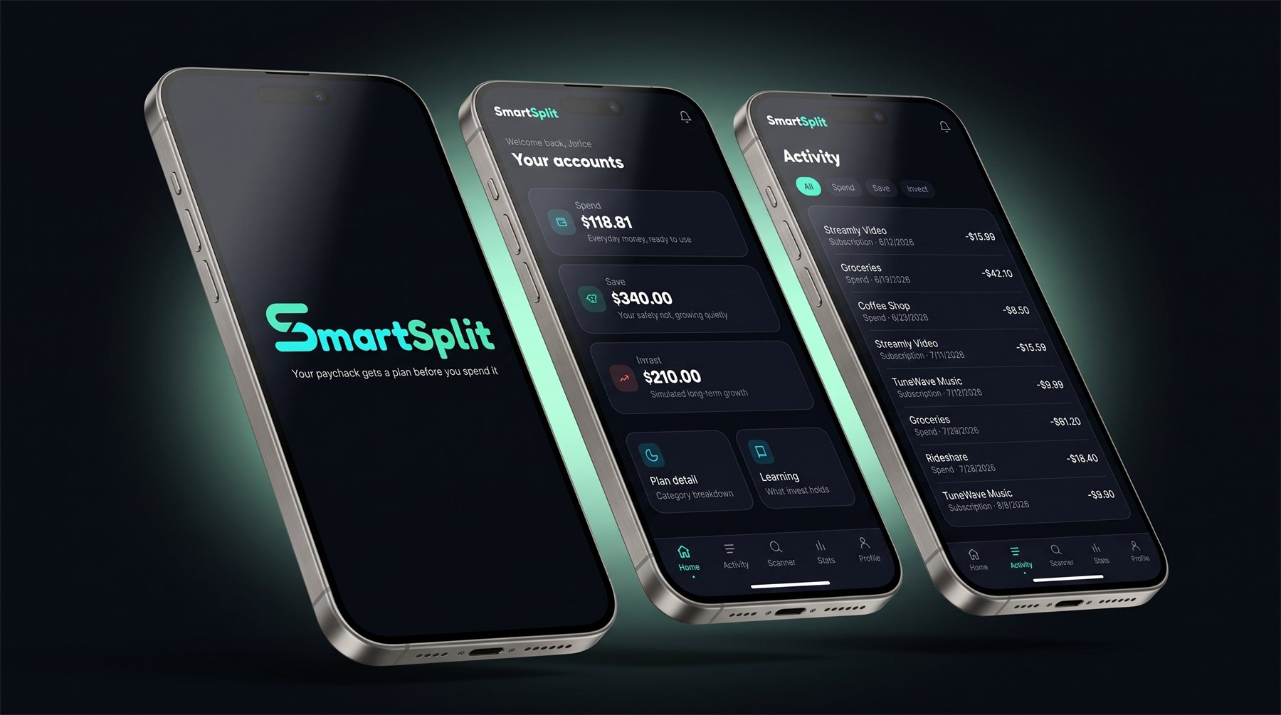
A budgeting app concept that automatically routes a user's paycheck into Spend, Save, and Invest accounts based on a short onboarding flow, covering sign-up through to the home dashboard as a working prototype.
Approach
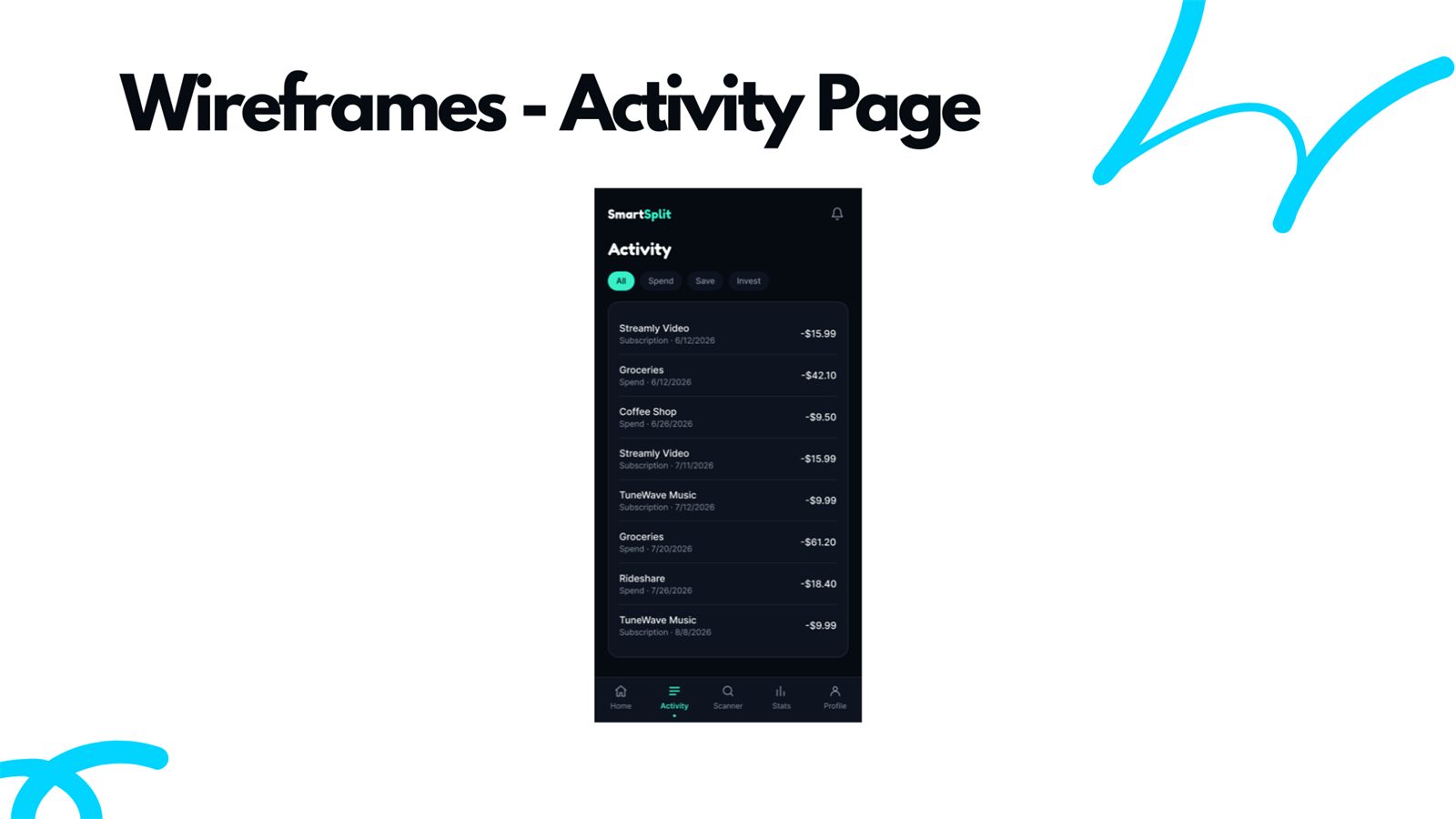
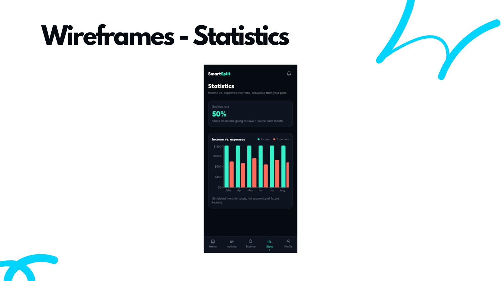
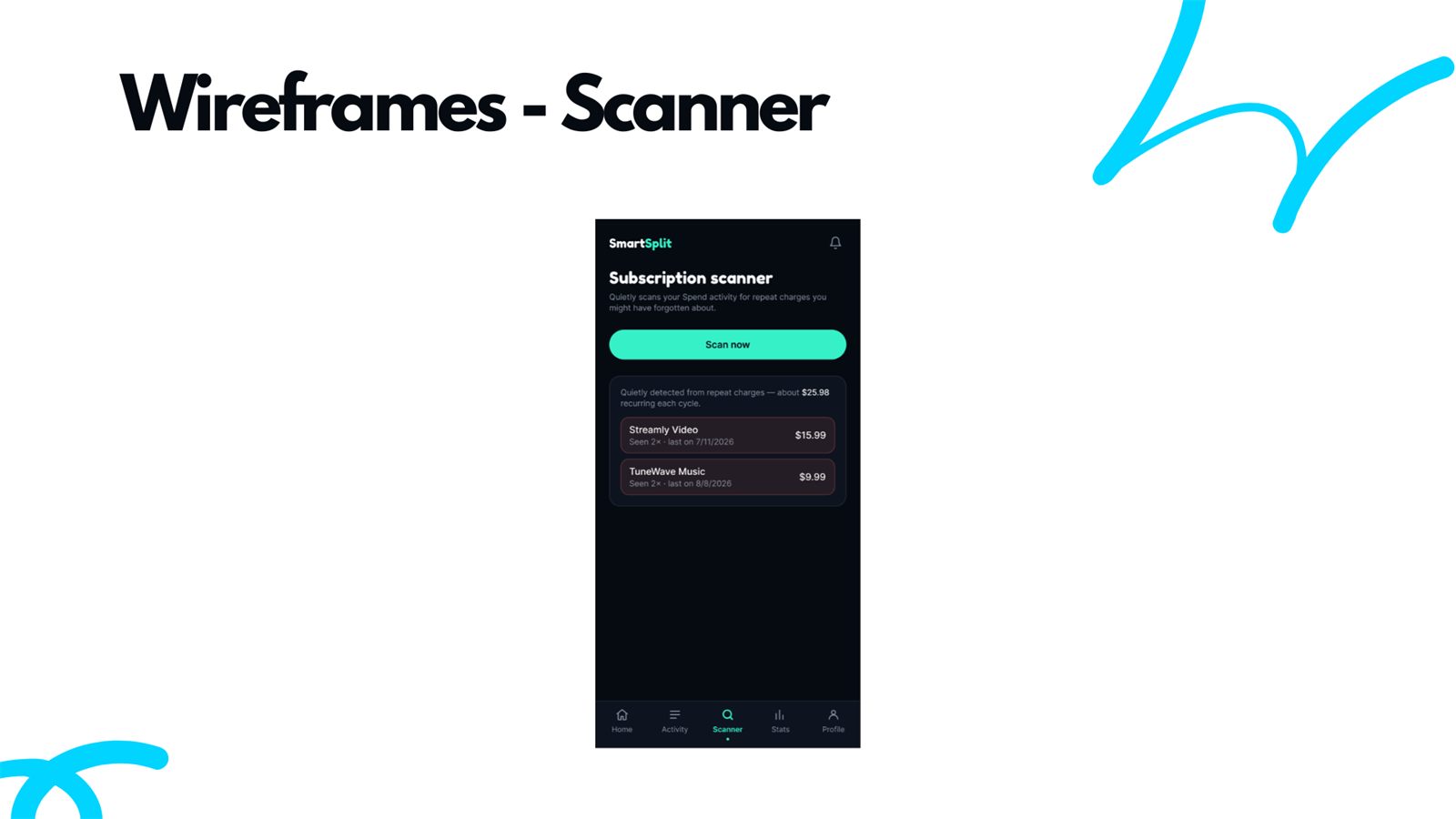
SmartSplit is built for international students who are newcomers to Canada, where banking rules and terminology can be genuinely hard to parse the first time you run into them. The idea was to give someone one place to see money coming in, where it's going across spending, saving, and investing, and enough context to actually understand what they're invested in, all without the app ever touching their real money or promising a return. The subscription scanner almost didn't make the cut, until I got hit with a random subscription charge myself, called my bank, got no real answer, and realized that's exactly the kind of invisible cost an app like this should be catching.
Selected Screens
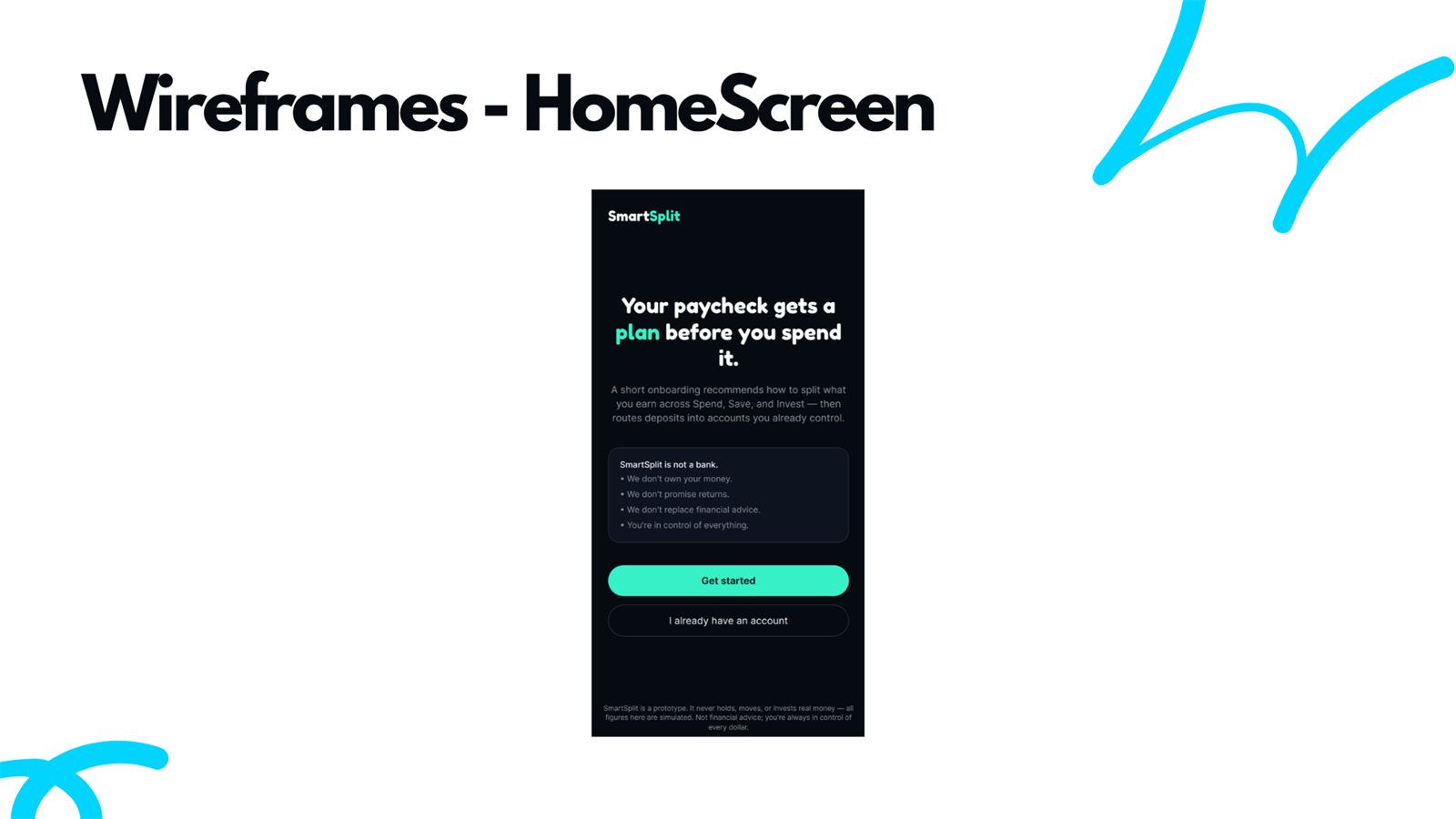
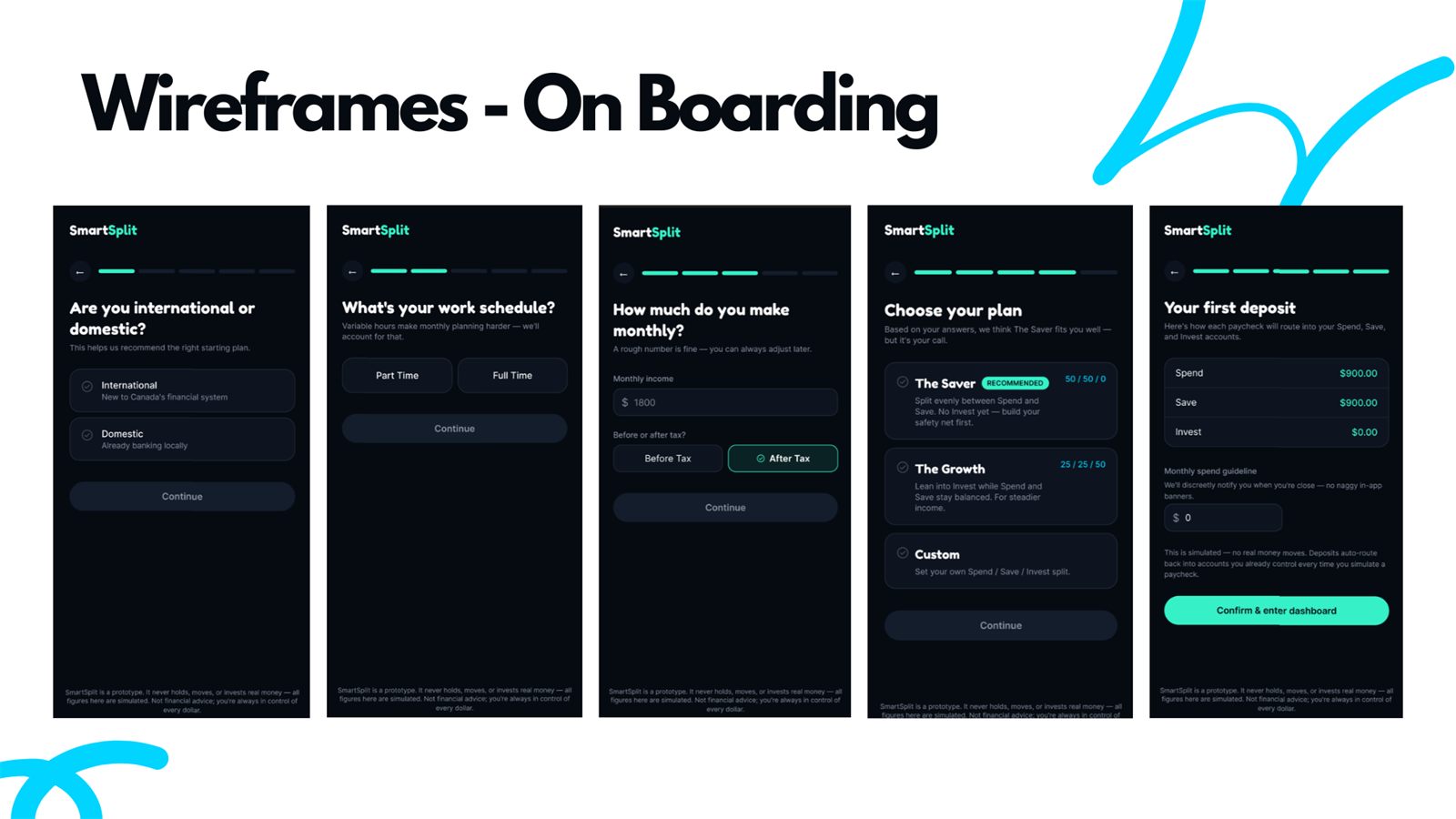
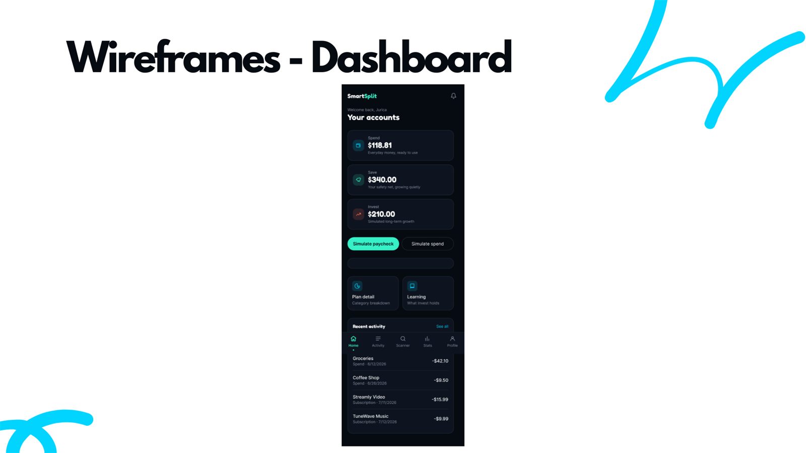
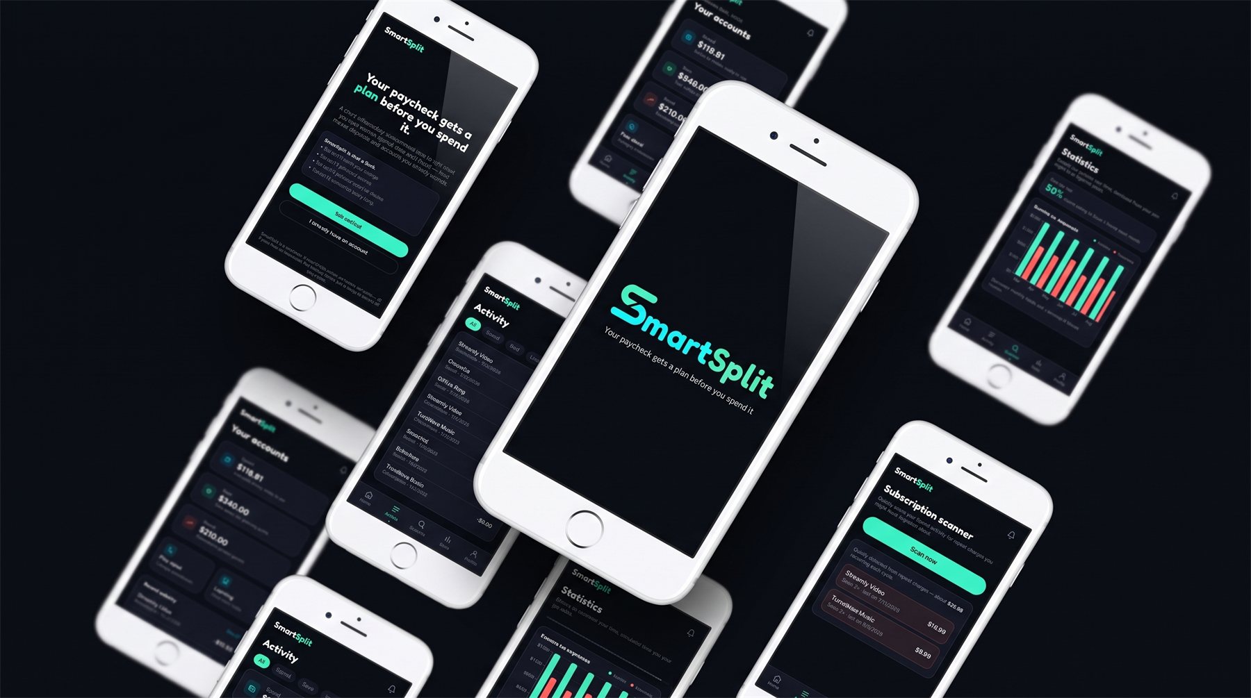
A closer look at the core flow, from onboarding through to the screens a user would come back to every day.
Figma Prototype
An interactive walkthrough of the onboarding and dashboard flow, click through it the same way a new user would.
Best viewed in fullscreen once the embed is live. Click the expand icon inside the frame.
Live App
The same flow, coded and running for real. This one you can actually use instead of just clicking through a prototype.
Running live on GitHub Pages. Open it in a new tab ↗ for the full experience.
Mockups
Reflection
Working out the onboarding flow was the part I spent the most time on, since asking someone five questions about their income and habits only works if every question earns its place. Getting the split summary at the end to read like an actual recommendation instead of a random number took a few passes.
If I took this further, I would design the empty and error states for the dashboard, since right now every screen assumes the user already has a healthy amount of activity to look at.