
Men's Health Magazine
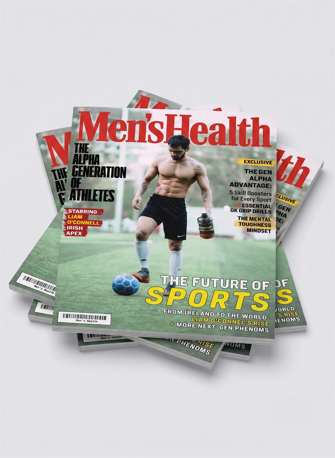
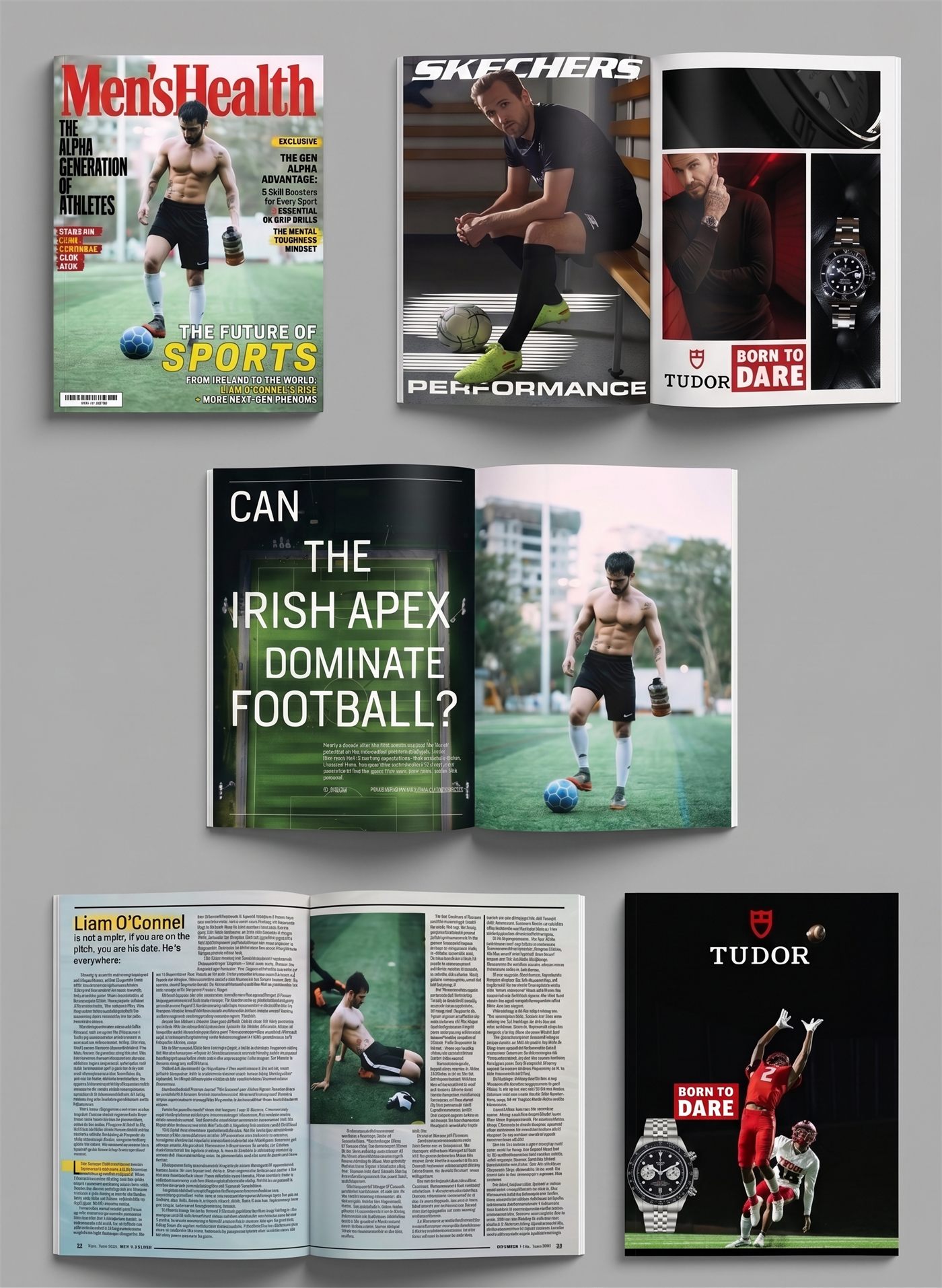
A magazine cover and layout concept built around a fictional feature story on a rising athlete. I wanted the cover to feel like it could actually sit on a newsstand next to the real thing, then carried that same energy into the ad pages and editorial spreads inside.
Approach
This was a redesign of an existing magazine rather than something built from scratch, so the goal was fitting my own articles, photography, and illustration into a real brand while pushing my InDesign skills further. The hardest part was staying on brand with almost nothing to go on: there wasn't much documentation on Men's Health's actual type, color, and logo standards, so a lot of it came down to educated guesses pulled from real issues instead of an actual style guide.
Inside the Issue
Reflection
This project made me think a lot about hierarchy on a cover, since there is so much competing for attention between the logo, the cover lines, the athlete, and the exclusive tags. I kept comparing mine against real issues on a newsstand to make sure it did not feel over designed.
If I came back to this, I would build out a few more interior spreads, since right now the feature story only really lives across two pages and could use more room to breathe.